Developed a dashboard and reporting workflow that helped a public-sector team organize information, monitor priorities, and support clearer project decisions.
Public-sector teams often have to turn complex information into something leaders, staff, contractors, and stakeholders can understand. The data may be coming from assets, projects, field updates, service areas, spreadsheets, GIS layers, program records, or operational systems.
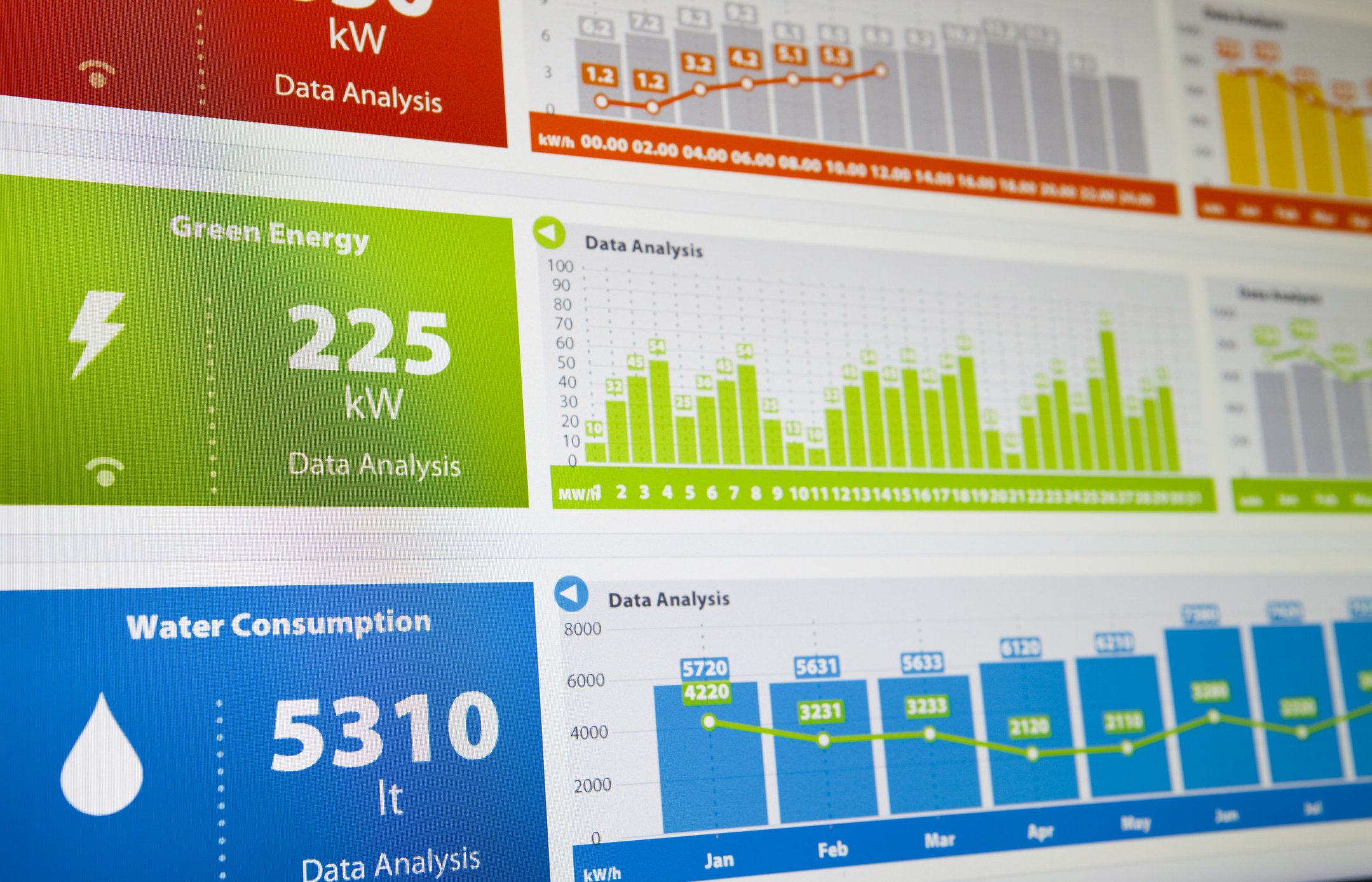
This project helped a public-sector team organize information into a dashboard and reporting workflow, making it easier to track priorities, understand context, and support decisions with less manual effort.
Project Summary
OrbitalIQ completed a dashboard-focused project where a public-sector team needed a better way to track and communicate project information. The work involved organizing source data, creating map-based views, designing dashboard indicators, and preparing a structure that made the information easier to review.
The dashboard gave the team a more practical way to monitor status, identify spatial patterns, summarize information, and support decision-making without relying solely on static tables or manual updates.
Project Phases
-
The first step was to understand who needed the dashboard and what questions it needed to answer.
Identified users, reporting needs, and decision points.
Reviewed available GIS layers, spreadsheets, program data, or project records.
Defined what information should be summarized, mapped, filtered, or tracked.
-
The source information was cleaned and structured so it could feed a dashboard reliably.
Reviewed fields, categories, dates, locations, and status values.
Standardized key attributes and removed obvious inconsistencies.
Prepared the data for maps, filters, charts, and summary indicators.
-
The information was turned into a dashboard that could support review, reporting, and coordination.
Configured maps, charts, indicators, filters, lists, and summary views.
Designed the layout for practical use by staff and decision-makers.
Tested how the dashboard handled updates, filters, and different user questions.
-
The final step was making the dashboard understandable and maintainable.
Prepared notes on data updates and dashboard maintenance.
Reviewed assumptions and limitations.
Supported revisions based on staff feedback.
-
Interactive dashboard
Map-based reporting view
Cleaned and structured reporting dataset
Status indicators, filters, charts, or summary cards
Web map or hosted layer configuration
Documentation for data updates and dashboard maintenance
Optional internal or public-facing views, depending on approvals
Need a clearer way to track projects, assets, field updates, service areas, risks, or program information?
OrbitalIQ Solutions can help turn public-sector data into dashboards, maps, and reporting tools that support practical decisions.